Back to demo index

gnuplot demo script: violinplot.dem

autogenerated by webify.pl on Sat Mar 11 15:39:43 2023
gnuplot version gnuplot 5.4 patchlevel 7alpha
#
# Various ways of displaying distribution of y values in a data file
# 1) Violin plots (bee swarm with large number of points)
# 2) Gaussian jitter
# 3) Random jitter
# 4) kernel density
#

# Generate a reusable set of data points from a mixture of Gaussians
nsamp = 3000 
set print $viol1
do for [i=1:nsamp] {
    y = (i%4 == 0) ? 300. +  70.*invnorm(rand(0)) \
      : (i%4 == 1) ? 400. +  10.*invnorm(rand(0)) \
      :              120. +  40.*invnorm(rand(0))
    print sprintf(" 35.0 %8.5g", y)
}
unset print

set print $viol2
do for [i=1:nsamp] {
    y = (i%4 == 0) ? 300. +  70.*invnorm(rand(0)) \
      : (i%4 == 1) ? 250. +  10.*invnorm(rand(0)) \
      :               70. +  20.*invnorm(rand(0))
    print sprintf(" 34.0 %8.5g", y)
}
unset print
#

set border 2
set xrange [33:36]
set xtics ("A" 34, "B" 35)
set xtics nomirror scale 0
set ytics nomirror rangelimited
unset key

set jitter overlap first 2
set title font ",15"
set title "swarm jitter with a large number of points\n approximates a violin plot"
set style data points

set linetype  9 lc "#80bbaa44" ps 0.5 pt 5
set linetype 10 lc "#8033bbbb" ps 0.5 pt 5

plot $viol1 lt 9, $viol2 lt 10


Click here for minimal script to generate this plot
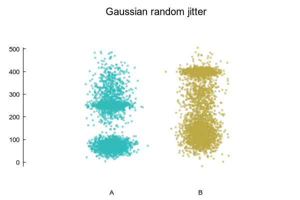


set title "Gaussian random jitter"
unset jitter

J = 0.1
plot $viol1 using ($1 + J*invnorm(rand(0))):2 lt 9, \
     $viol2 using ($1 + J*invnorm(rand(0))):2 lt 10 


Click here for minimal script to generate this plot
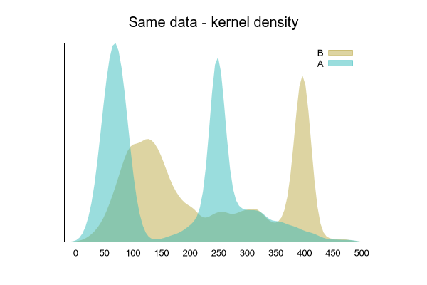


set title "Same data - kernel density"
set style data filledcurves below
set auto x
set xtics 0,50,500
unset ytics
set border 3
set margins screen .15, screen .85, screen .15, screen .85
set key

plot $viol1 using 2:(1) smooth kdensity bandwidth 10. with filledcurves above x1 lt 9 title 'B', \
     $viol2 using 2:(1) smooth kdensity bandwidth 10. with filledcurves above x1 lt 10 title 'A'


Click here for minimal script to generate this plot


#
# Save each kernel density plot to a data block 
# Then replot, mirrored, along the vertical axis
#

set title "kdensity mirrored sideways to give a violin plot"

set table $kdensity1
plot $viol1 using 2:(1) smooth kdensity bandwidth 10. with filledcurves above y lt 9 title 'B'
set table $kdensity2
plot $viol2 using 2:(1) smooth kdensity bandwidth 10. with filledcurves above y lt 10 title 'A'
unset table
unset key

set border 2
unset margins
unset xtics
set ytics nomirror rangelimited

set xrange [-1:5]
plot $kdensity2 using (1 + $2/20.):1 with filledcurve x=1 lt 10, \
     '' using (1 - $2/20.):1 with filledcurve x=1 lt 10, \
     $kdensity1 using (3 + $2/20.):1 with filledcurve x=3 lt 9, \
     '' using (3 - $2/20.):1 with filledcurve x=3 lt 9


Click here for minimal script to generate this plot


set title 'Superimposed violin plot and box plot'

set style fill solid bo -1
set boxwidth 0.075
set errorbars lt black lw 1

replot $viol2 using (1):2 with boxplot fc "white" lw 2, \
       $viol1 using (3):2 with boxplot fc "white" lw 2


Click here for minimal script to generate this plot